Settings & branding
Find features on desktop, tablet and mobile
Use the shared menu, searchable dropdowns and compact workflows.
Navigation by device
Desktop/tablet use the left menu while the main page scrolls independently. Mobile has a horizontally slidable bottom menu and a bottom-right three-line control that expands navigation vertically. Team, Help and Profile are in the expanded menu where authorized. Owners sign out using the button beside the Profile heading.
Searchable choices
Dropdown choices include built-in search for long option lists. Type a name or term, select the matching option and check the chosen value. Search in a dropdown filters that control’s options; it is not a site-wide search or permission grant. This Knowledge Center searches its public articles separately.
Compact sections and popups
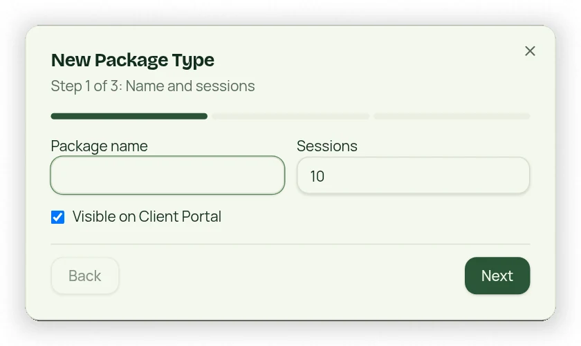
Many Settings and list sections collapse. Creating membership/package/appointment types, products and referral campaigns uses a three-step popup rather than a long inline form. If an expected control is not visible, first expand the section and check your role permissions.